FLEABAG Seasons 1 & 2: A Deep-Dive Cinematography Analysis
Alexandra Lobel is a writer, script supervisor, and avid lover…
Phoebe Waller-Bridge’s Fleabag is a masterpiece in storytelling. The cinematography mixed with the expert writing and perfect casting come together to create one of the most impactful and beautiful television shows in recent years. The first season is adapted from Waller-Bridge’s one-woman play of the same name. It follows the protagonist who is only known as Fleabag (Phoebe Waller-Bridge) as she navigates her failing café, her rocky familial relationships, and an unfavorable love life, all while still processing the passing of her mother and best friend. Despite the darker themes of the show, it is cleverly comedic and expertly witty. The second season returns with a drastic shift in tone.
Fleabag is on better terms with her sister, her café is thriving, and a more consistent and reliable romantic plotline is introduced. The second season is still delightfully hilarious but also includes deeper and more emotional themes that differ from those in season one. Both seasons are incredibly well-crafted, though I think I may be a bit biased towards season two, as I stand by my belief that the season two premiere is possibly one of the most well-done pieces of television ever. The themes of both seasons are heavily supported by the visuals, particularly in emphasizing the undertones and tonal shifts between seasons one and two.
First and foremost, the cinematography in Fleabag is such a well-used storytelling tool as it expertly cues the viewer into what’s going on, beyond just what the actors are saying, and it can more subliminally push the central themes of the show while emphasizing the underlying tones, feelings, and motives of the characters.
One of the biggest things to examine in relation to this is the show’s coloring and choice of angles/framing.
Standout Coloring
Across seasons one and two, the coloring and visual aesthetic match the tone very well, and push the respective themes forward. Season one is visually intense and abrasive, whereas season two is gentle, softer, and kinder, though still filled with challenge and significant difficulty; Fleabag is just in a different place, and the visual aesthetic is highly reflective of that.
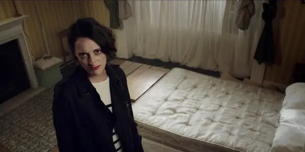
Season two’s lighting is also more inviting and welcoming, while season one’s is perhaps more off-putting or visually uncomfortable; something is off. In season one, the coloring is rather static. The colors present are dark and dull, and the shots feature high contrast, with low saturation and vibrancy; for the most part, they are bland, flat, brash, and blown-out, though this works incredibly well for what season one is about and it matches the chaotic, stressful, and tense tone of the season very well.
A summative way to describe this is that the coloring looks like it is a cloudy day, every day; it is cold and dismissive, lacking joy and life. This is made especially clear through the flashback scenes Fleabag has with Boo (Jenny Rainsford). These scenes, particularly prominent in season one, are largely filled with such warm and soft light, emphasizing the love and happiness that were clear in Fleabag’s life, but now in the present, things are bleak, and the drab, colder lighting and coloring is highly reflective of that.
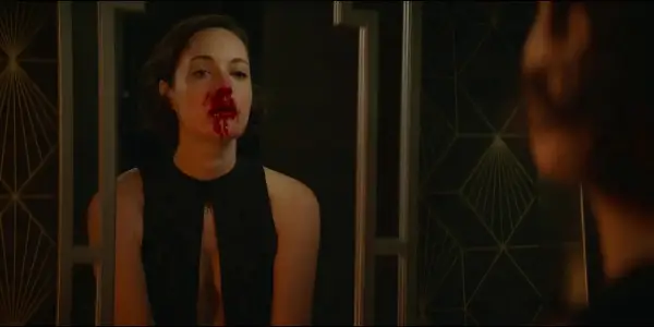
Season one has a much more muted color palette, whereas season two’s is richer with a greater depth. In the second season — and this is introduced immediately from the opening shot of the first episode — there is much darker, more romantic lighting from the get-go. A lot of reds, and deeper, richer hues, which complement the added romantic plotline very nicely. It also visually signals to the viewers that things are different and things are changing. In that opening shot of Fleabag washing her hands in the bathroom, the lighting in that scene alone is so unbelievably different from season one. It’s so much moodier and it’s got that soft, yellow glow from the sconces on the wall, and the blood on her face is bright red, contrasting against the rich green walls around her.
The set tone right from the start is such a strong signifier that this is a different take on this person. There is clear growth, things are turning around, her life has improved from season one and it’s evident that the visual aesthetic, too, has changed and improved.
This is not to say at all that the visual tones of season one are bad in any way — as that lack of color and visual discomfort obviously serve a purpose in the aesthetic they exist within and how they support the story; her life is lacking color, both physically and metaphorically; lacking love, warmth, and joy — but more so that the visuals have become more pleasant to look at; they are warmer, just as Fleabag’s life is beginning to grow in that direction as well.
Untraditional Angles
The first season of Fleabag features multiple bizarre and untraditional shots, especially when Fleabag breaks the fourth wall and looks at the camera directly, which can be seen when she arrives at her sister’s (Sian Clifford) house and looks up to the camera angled down by the doorframe, when she sees that her boyfriend, Harry (Hugh Skinner), packed up their bedroom and she looks up to the camera in the corner of the room, and when she first arrives at her father’s (Bill Paterson) house in episode one and looks at the camera directly through the mail slot in the door.
These sequences all take a sort of chaotic, rather odd approach to framing; all more than intentional of course. The bizarre angles of season one immerse the viewer deeper into the show, especially when that’s being done alongside with her talking directly to the viewer. That makes sense, especially for the first season when she is really relying on the camera as her point of constant and consistent connection with someone since she isn’t getting that with anyone in person, at least in that stable of a way. She obviously continues to talk to the camera all the time in season two, but it’s a very different relationship.
In season one, the odd angling makes it feel very much like the viewer is a fly on the wall — rather than feeling like a person in the room — which simultaneously brings the viewer in while also making them feel distant, almost like you are peeking into her life as an observer. The oddly intimate look at Fleabag’s life through these unnatural angles emphasizes the sometimes bizarre nature of her relationship with the audience, which contrasts nicely with how straightforward many of the shots are between her and the Priest (Andrew Scott) in season two, even when she speaks to the audience.
As Fleabag’s relationship with the Priest develops more intimately in the second season, their scenes begin to feature much more straightforward set-ups: typically just a standard wide shot accompanied by two medium shots. As season two begins to dismantle these weird angles, we are invited into Fleabag’s life again more intimately, though in a different way; the viewer/camera’s relationship with Fleabag is clearly displaying change. Also, in season two, the romance with the Priest is so gentle and slow, which is really what Fleabag needs; it’s not intense and exhausting like we’ve seen with her other relationships. It of course has its struggles, but he’s meeting her where she’s at, and he’s patient and interested in her genuinely, and all that is reflected in how the pair’s shots are lit and framed, of course in combination with the show’s powerful dialogue, and how Fleabag speaks to the camera.
For example, when Fleabag and the Priest are at her café and he is holding Hillary the guinea pig for the first time, she looks over her shoulder at the camera, clearly crushing on the Priest, and that’s not unnatural — she’s just looking over her shoulder. It’s different than when she’s on the doorstep and looks up to the weird angling of the camera in the corner of the doorframe.
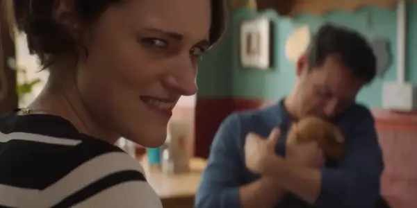
Looking up feels very out of the way, whereas when she’s with the Priest and looks at the camera, it’s significantly more natural, further emphasizing her growth and ease in her relationship with the Priest.
Concluding Thoughts
Season one is very uncomfortable and you are thrown into that discomfort with a forceful sympathy from the get-go. Not just from what you’re watching Fleabag do and how the plot unfolds, but from these visual cues that tell you that this protagonist is in the throes of processing something major, and you, the viewer, are about to experience all that with her across the next six episodes.
However, that feeling that’s thrust on the viewer for season two is so different. Not only because you are verbally told some of the growth Fleabag has undergone since we last saw her, but her confidence is drastically different; she is less unsure of herself, and the visual cues support that, making sure the viewer is aware. Whenever I suggest this show to someone, I encourage them to watch the first episode of season two right after they finish season one, as the visual tonal shift is most apparent — and drastic — when seeing one right after the other.
Fleabag is one of my favorite shows of all time; its clever wit, complicated romance, and incredible writing make it one of the most rewatchable and beautifully done shows I have ever seen. Phoebe Waller-Bridge, you are a genius. Both seasons are currently available to stream on Amazon Prime Video.
Does content like this matter to you?
Become a Member and support film journalism. Unlock access to all of Film Inquiry`s great articles. Join a community of like-minded readers who are passionate about cinema - get access to our private members Network, give back to independent filmmakers, and more.
Alexandra Lobel is a writer, script supervisor, and avid lover of all things film and television. She is currently finishing her degree in Television, Radio, and Film from the S.I. Newhouse School of Public Communications at Syracuse University, all while continuing to watch virtually every rom-com ever made.
