A Place For Black And White In A World of Color
Christine is a software engineer currently working in the animation…
It’s an established idea that film came into its own as an art form in black and white. Film lovers revere touchstones like Citizen Kane and Casablanca without imagining that they would be improved if they were in color – we know they’re great in large part because of their brilliant use of monochromatic cinematography. Despite this near universal admiration of black and white as a cinematic expression, very few of today’s filmmakers embrace it in their own work.
Although the transition from black and white to color as the dominant form for filmmaking occurred over many years and for many reasons, black and white had all but vanished from theaters by the late 1960’s. Since then, films produced in black and white have been largely relegated to independent, art house fare, often considered to be nostalgic or even pretentious by mainstream audiences.
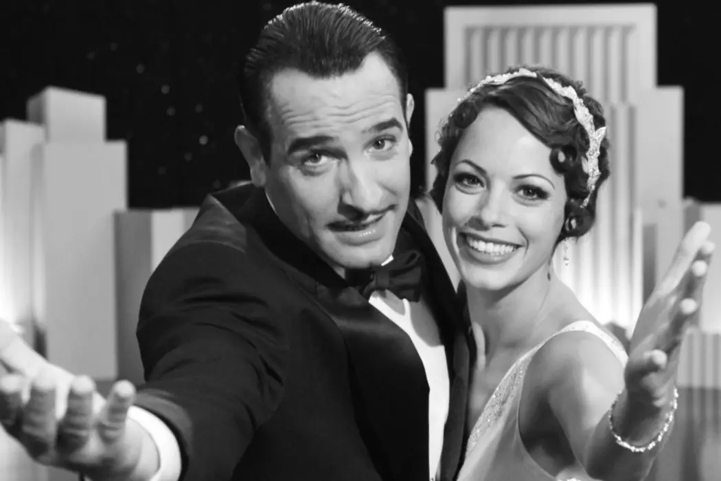
Black and white began a minor resurgence in 2011, when The Artist, a joyous homage to the beginning of the sound era, won Best Picture at the Academy Awards. Other prominent filmmakers embraced the form in the following years, including Noah Baumbach with his New York coming-of-age film Frances Ha, Alexander Payne with his midwestern dramedy Nebraska, and Tim Burton with his dark stop motion animation Frankenweenie. This comeback, however small, brings up questions about how we are to judge and interpret the black and white films of today as opposed to the black and white films of cinema’s golden era, when they dominated the art form.
Our cinematic world differs vastly from the era of black and white’s dominance, both in the available technology and in the perceptions and expectations of moviegoers. Given this reality, does it even make sense to make black and white films today? Can black and white be used in innovative ways to tell new stories, or are the filmmakers who employ it simply indulging in pretentious esotericism or nostalgia for a bygone era of film?
There’s a prevailing conception that film simply outgrew black and white. Many assume that as soon as color film technology became available and affordable, filmmakers made the switch. The truth is much more complicated. Unlike the transition from silent to sound films, which happened virtually overnight, color was not immediately embraced as a positive addition to film as an art form. In order to make sense of the role that black and white can play today, let’s take a look how and why it was abandoned in the first place.
A Chromatic History
The idea of color was present since the invention of film. Far before it was possible to reproduce the colors actually seen by the camera, filmmakers used various techniques to add color after filming. Early on, artists would hand paint the film stock frame-by-frame – the most legendary example of this process is the color version of George Melies’ A Trip to the Moon. Later, when filmmaking became big business, entire reels of film stock were tinted single colors. This can be seen in D.W. Griffith’s Intolerance, in which each section of the anthology is tinted a different color to create a different mood.
The technology to reproduce color existed earlier than many realize – several processes of varying quality and chromatic accuracy were used on a limited basis during the twenties and early thirties, often in high-budget musicals. Still, color had little foothold until Technicolor introduced its three-color system, patented in 1932. It involved filtering light by color and projecting it onto three film strips, which were then dyed their corresponding color (red, green, or blue) and combined to produce the final image. This process could reproduce a full gamut of rich, bright colors, resulting in the classic late-thirties Technicolor look that we know from films like The Adventures of Robin Hood, The Wizard of Oz, and Gone with the Wind.
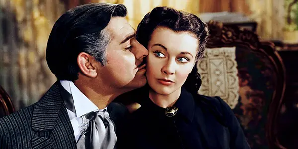
The process was also famously expensive and restrictive. A three-color camera could cost over thirty thousand dollars, and Technicolor controlled each aspect of the process stringently, requiring a special consultant to supervise on set. But since the company had a virtual monopoly on color film technology, there weren’t any cheaper options. This severely limited the number of color films produced during the forties.
The high cost of Technicolor was not the only factor that delayed the widespread adoption of color films – the process was also artistically limiting. In a time when auteur directors were constantly pushing the artistic boundaries of cinema, the costly color process was seen by many as at best unnecessary, and at worst counterproductive to the creative goals of the art form. Technicolor severely limited the range of cinematography techniques available to filmmakers – deep focus was impossible, and lighting on set had to be extremely bright, preventing any nuanced use of shadows and disallowing outdoor filming. Technicolor productions had to be focused largely on pulling off the color convincingly, not on innovative storytelling.
In 1950, a new color film stock called Eastmancolor was introduced, ultimately breaking Technicolor’s monopoly. It could be used in a standard camera, making it far cheaper and more practical with similar quality and less stringent lighting requirements. The technology was licensed to every major studio, and within three years had completely replaced Technicolor.
Even when it became financially and technically feasible due to the improvements and ubiquity of the Eastmancolor process, many filmmakers remained resistant to embracing color. This reluctance was shared by critics and even audiences – fundamentally, color ran counter to the ingrained understanding of what a film was supposed to look like. Similar to the ambivalence surrounding 3D technology today, color was frequently seen as distracting, unnecessary, a mere marketing ploy, even vulgar. And like our issues with high frame-rate, many thought that it looked almost too real – occupying some uncanny valley between film and life. It would take another decade before color films were seen as aesthetic equals of their black and white counterparts.
Ultimately, the demands of television brought color into full industry dominance. When color TV sets became commonplace, black and white movies were seen by studios as unable to compete with the small screen. At the same time, color technology improved and filmmakers began to find inventive ways to integrate color into their work to create moods, both realistic and fantastical. Black and white had vanished slowly, then all at once.
Color is today’s baseline cinematic expression. Because audiences are so used to color, filming in monochrome subverts their expectations immediately, signaling that an artistic choice has been made that they need to connect to the narrative. In this way, black and white functions in a fundamentally different way than it did in in the past – filmmakers are expected to use it in more specific ways to enhance or subvert the story and tone of their films. This can be done in many ways, creating different cinematic experiences.
Evoking the Past
A useful distinction to make when analyzing the black and white films of today is between films that use black and white to pastiche older genres and styles of filmmaking, and those that choose to use it for purely aesthetic reasons, with no reference to the past.
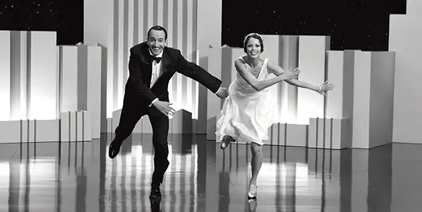
French director Michel Hazanavicius’s The Artist is the most prominent recent example of the first category, the retro pastiche. Hazanavicius doubled down on his embrace of period film techniques by making The Artist predominantly silent, thus producing the film as it would have existed in the time of its setting in the late twenties. While studios blanched at the commercial difficulties that such a film entailed, audiences embraced it – not only was it beautifully made, it was different from anything in theaters at the time. The Artist is able to reproduce not only the visual look of the era, but also the tone – it’s permeated with the excitement of an art form still in its infancy. The effect was no less than magical, proving to the industry that people would turn out for a black and white film that offered them something interesting.
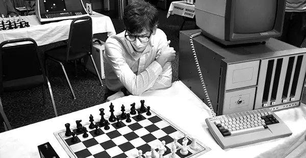
Andrew Bujalski’s 2013 film Computer Chess also falls into the category of retro pastiche, but creates an entirely different experience. Set in 1980, it’s a loosely-structured mockumentary centering around a group of computer science researchers gathered in a hotel to pit their chess-playing algorithms against each other. Grainy black and white is used to imitate the look of amateur video shot on consumer cameras. The film captures the time and place in uncanny realism – with unmannered performances and shaky, haphazard cinematography, it can almost be mistaken for a real documentary in its opening scenes.
While The Artist used black and white primarily in service of creating a love letter to a bygone era of filmmaking, Computer Chess ties monochromaticity into the movie’s themes. The lack of color reflects the state of mind of the researchers at the conference – these people are focused on their work to the point of obsession, unable to take in the full gamut of human experience. This connection is made clear by a single color scene, the only one that takes place outside the bounds of the hotel.
Nebraska: Modern Lives in Black and White
The second category of modern black and white films are those that don’t use black and white to make reference to a genre or create an authentic sense of period, and theoretically would work if they had been shot in color. From a commercial standpoint, these films are an even harder sell than their more nostalgic counterparts — there’s no obvious reason for audiences to choose them over similar color films. They’re also more likely to be viewed as pretentious, because the choice to film in monochrome usually has no explicit function in the narrative.
Sideways and The Descendants director Alexander Payne’s 2013 foray into black and white, Nebraska, depicts an old man scammed into believing that he has won a large sum of money despite his family’s attempts to convince him otherwise. Although the story would be unchanged in color, black and white suits the film well. The bleak midwestern landscape of the titular location wouldn’t have much color anyway — black and white actually imparts more visual interest than the de-saturated greys, browns, and greens that likely would have characterized a color version of the film. While Nebraska isn’t set in the past, it is about the past, and our relationship to it as we age or watch our loved ones age. The instant sense of nostalgia that black and white imparts therefore subtly underscores the film’s themes.

When discussing the decision to film Nebraska in black and white, Alexander Payne mentions no specific psychic or aesthetic connection to the story told in the film, but instead points to monochrome’s inherent qualities as a visual medium, noting that “[black and white] left cinema only for commercial reasons – it never left fine-art photography.” He makes a good point: monochrome remains a standard in still photography, from National Geographic to the average teenager’s Instagram feed. Black and white photos allow for a greater focus on composition, because the eye isn’t drawn to all corners of the frame by pops of color. Details and textures come to the forefront, and stark contrasts make for dramatic uses of light. All of this is as true of the moving image as it is of the still image.
It’s impossible to say how Nebraska would have been received had it been it color – would it, as the producers predicted, have made more money? But if it did, would it have garnered the same level of awards-season buzz?
Fury Road : A Monochromatic Case Study
While weighing the values of color and black and white, it would obviously be helpful to watch a film fully realized in both forms. This is usually impossible, but there is one exception that allows us to do just that. Following the release of his immensely successful and critically lauded car chase thriller Mad Max: Fury Road, director George Miller stated that the best version of the film was actually in black and white. The following year audiences got to make that judgement themselves – a fully monochromatic version of Fury Road, the “black and chrome” edition, was released in a limited run in theaters and later on DVD and digital.
This affords us a great opportunity to compare color and black and white directly, and to explore the strengths that each form brings to the table. In this critical experiment, we’ve controlled for story – both versions have the same airtight, breakneck-paced edit.

The standard version of Fury Road is not an average color film by any means. Heavily saturated color grading was used in concert with wild production design to create a vibrant and surrealistic world. It’s not unfair to imagine that a monochrome version would diminish this core strength of the original.
The black and white version of the world does feel very different, but it’s no less fantastical than the color version – if anything, it feels even more removed from ordinary reality. Miller describes this effect in an introductory video to the release: “Something about black and white, the way it distills [the film], makes it a little bit more abstract.” In particular, a series of shots of Charlize Theron’s Furiosa falling to her knees on a sand dune feel so quintessentially cinematic that they could have been lifted from an Ingmar Bergman film. Black and white’s ability to render details is on full display, especially in close-ups – you can practically see every individual hair on Tom Hardy’s face. Ultimately, the lack of color is a trade off – one layer of visual interest is removed, but another is added.
One weakness of the black and white version is that it’s more difficult to track fast-moving action, especially during the quick-cutting, intricately choreographed fight sequences on and around moving vehicles. It’s likely that if the film was produced in black and white from the start, Miller would have had to tone down the visual density a bit to alleviate this issue.
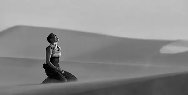
Nebraska certainly uses black and white to its advantage, but the black and white version of Fury Road better demonstrates the untapped potential of monochrome combined with modern cinematic techniques, especially visual effects. It makes one wish that more mainstream filmmakers would attempt the form, especially in genre films. As a recent example, Denis Villeneuve’s Blade Runner: 2049 would have been a great candidate: like Fury Road, it uses color in creative and surrealistic ways, but would have had a different and interesting dramatic flavor in black and white.
The Future
Understandably, it’s big ask for studios to risk releasing a mainstream film in monochrome. Tim Burton’s Frankenweenie proved their apprehension to be valid — although critically adored, it was a box-office failure, taking in a paltry eleven million its opening weekend. Hopefully the buzz that Fury Road’s special edition received can convince studio execs that a high-budget black and white film would be worth the gamble, but fans of black and white shouldn’t hold their breath.
It’s impossible to deny that making a black and white film in 2017 is a fundamentally different endeavor than it was in the past. Since the baseline of what people expect to see at the theater is faithful reproduction real-world color, black and white is jarring. Rather than diminishing the power of the form, this fact opens new doors for filmmakers to use black and white in inventive and interesting ways, both to depict the past and to create new worlds.
This opportunity also comes with risk. Just as audiences were resistant to color in the forties and early fifties, many moviegoers of today will be hesitant about black and white – it’s just not what most people think movies should look like. But as The Artist proved, it’s not impossible to create a black and white film that connects with audiences. We can only hope that directors, studios and movie fans will continue to give black and white a chance. After all, the movies became art in black and white. There’s no reason why it shouldn’t be a part of their future.
Do you think black and white is still a relevant way to make films, or is it purely a product of nostalgia? What recent film would you love to see in black and white? Tell us your thoughts in the comments below!
Does content like this matter to you?
Become a Member and support film journalism. Unlock access to all of Film Inquiry`s great articles. Join a community of like-minded readers who are passionate about cinema - get access to our private members Network, give back to independent filmmakers, and more.
Christine is a software engineer currently working in the animation industry. Hates Ferris Bueller's Day Off, Loves Star Wars. Writes at hackingcinema.com


