What Is Mise-en-Scène? Pt II: Cinematography & Editing
I love film, more than people probably, and I will…
This is the second and last part of “What Is Mise-en-scène”. Find part one (dealing with mise-en-scène of setting, costume and objects) here!
Cinematography
If there is an important element in mise-en-scène then cinematography is it. Everything about the actor, the objects, and the setting can be imbued with a variety of meanings depending on how the cinematography is orchestrated. The first thing to impact on the scene is the size and shape (aspect ratio) of the shot, along with the medium used to film it.
In Classic Westerns, or Hollywood epics, Super Panavision (with an aspect ratio of 2.20:1) or Cinerama 70mm (2.59:1) was used to create scale, showing the breadth of the landscape and the cast, and reinforcing the importance of the story or event. For the most part, these days, films simply use a standard 35mm format (commonly shown in cinemas as 1.85:1 or 2.39.1), with some occasionally experimenting with the old 4:3 aspect ratio of standard VHS, or in some cases using a new aspect ratio entirely (Xavier Dolan’s Mommy uses a 1:1 ratio for example). Aspect ratio effects how well the film fills the viewer’s vision and so has a big impact on how they perceive the world inside the film, and relate to it
Medium is perhaps a bigger choice for filmmakers, with many still believing (and rightly so) that using film, as opposed to digital, accentuates the complexity of light and also gives the final film richer colours. Film also commonly gives the look of a film a gentler, more atmospheric feel when compared to digital. Whose occasional starkness can make the subject matter appear cold and distant from the viewer.
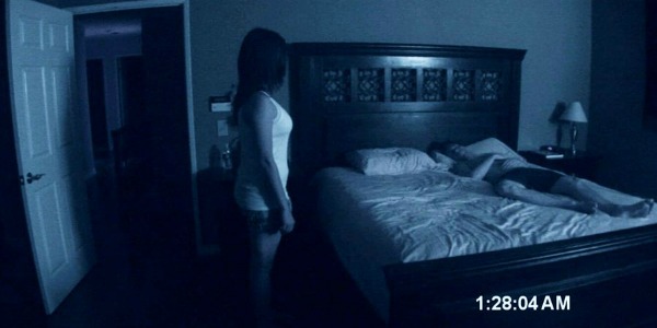
The aspect ratio of a film’s image is not always made out of a particular choice. Some productions can only afford so much, while others do not deem it entirely important to the film’s look. The same goes for the medium, whether it be on film, digital, or in the odd case, on VHS. Sometimes the use of a standard digital camera is clearly a choice to cut production costs, sometimes it is vital for the look of a film. In the case of the original Paranormal Activity film, it worked both ways. Being a cheap production choice accessible to the filmmaker, but also pivotal to the look and hence the believability of the film.
American and European Forms of Cinematography
There are two distinct forms of cinematography; American (Hollywood) and European. The difference between these two is that American cinematography is usually practised when the point of the film is to entertain. So simple shots are used, actors are lit clearly, and the camera always sticks to where the action is happening. European cinematography, on the other hand, is used on the whole with disregard for what the audience wants to see, instead fixing on what the director wants them to see. Wide shots are used, where actors can stand up or sit down, or static shots, which actors can walk out of. All this is done to create texture and in many cases, realism.
These two types of cinematography were borne out of Classical Hollywood Cinema and primarily the French New Wave. However, these days they mix quite freely. The French New Wave actually derived a lot of their inspiration for narrative from the Hollywood Western, while the American New Wave (Coppola, Spielberg etc.) were inspired by the visual work of Godard and Truffant. These days some Hollywood directors explicitly use European style cinematography, specifically filmmakers such as Wes Anderson and Sophia Coppola. Overall European cinematography is seen as more artistic and more challenging to an audience.
The most important part of cinematography when considering mise-en-scène is where the actor has been placed and how they have been lit. A lot about this can, firstly, imbue the character with a particular place in their fictional world and secondly, lead the audience to project certain qualities on to the character. This is used more often than you would imagine. In the film Zombieland, for example, when Columbus first meets Tallahassee, the camera shot is wide. This is done not only to include the landscape and carnage but to show how small and defenceless Columbus looks in it. Comedy loves a wide shot, and you’ll find this technique used in a lot of great Hollywood comedies.
Camera Placement
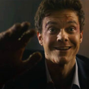
Camera placement is incredibly important and static cameras have conjured up some of cinema’s greatest scenes. The close-ups on Ash as he runs into the camera in the Evil Dead trilogy, done to emphasise the expressive madness in Bruce Campbell’s face. Michael Myers sitting up behind Laurie in Halloween, done to put the audience in the unsafe position of knowing what Laurie doesn’t. The greatest examples, of course, are seen in Orson Welles’ Citizen Kane where increasing the depth of field on the camera meant a great deal could be shown in the back of shot, behind the main action. Most notably this can be seen in one of the opening shots where Kane plays in the snow while his future is being decided on within the house.
A great deal of technology can be also implemented when filming a scene, and each one can bring a new facet to the feel of it. In the opening of A Touch Of Evil a crane shot is used to pull the audience down into the action, trapping them in the narrative. The mixture of a tracking shot with a crash zoom in Jaws gave a tremendous affect. Not only drawing the audience into Brody’s fear but simultaenously making the world around him seem to swell, putting both he and the audience off kilter in the shock of another shark attack.
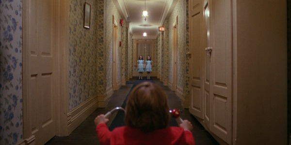
Primarily though, cinematography is most noticeable, and most important, when it draws attention to the character’s mood and the atmosphere of the narrative. Stanley Kubrick (together with his frequent collaborator John Alcott) was a great fan of the long shot. Most importantly he used long shots when something confusing or scary to the character was approaching. This would give the scene a noticeably tense feeling, as the audience were forced into the position of watching the threat approach. This can be seen throughout The Shining. Alternatively David Lean used the same shot in Lawrence Of Arabia to create anticipation.
When it comes to mood and atmosphere, however, nothing effects like lighting. The lighting of a character, or even the absence of it, can swing the feel of a scene entirely. Film Noir of the 1940’s was the greatest proponent of using lighting to shock and scare. No doubt derived from earlier work in 1920’s German Socialist cinema Film Noir used the efficacy of black and white to create mystery and fear in the shadows it created. Any Film Noir film is a great example of this but Double Indemnity is perhaps the definite work of its kind.
Thought lighting can be used in many ways. In Richard Linklater’s Before Sunrise trilogy the characters are always well lit, to emphasise the normality of their environments. In the opening of Eternal Sunshine Of The Spotless Mind Joel drives in darkness with only the occasional streetlight lighting his face, emphasising the chaotic nature of his thoughts and feelings. In The Third Man the headlights of a car are used to literally shine a light on the identity of Harry Lime.
One of the greatest shots of contemporary cinema can be found in the film Mystic River. While Dave breaks down at the foot of the stairs he is lit only by external light, his anguish accentuated by the shadow of falling rain. This is one of the greatest examples of how lighting can be used to emphasise a character’s mood.
The Actor
So much of what is in the mise-en-scène is static – it is very easy to forget the actor themselves, especially as the mood they are conveying is usually self-evident in their look and in their words. Also, as all the techniques included in this article are used to enhance the mise-en-scène and hence the actor’s performances, it can seem besides the point to consider them. However, their performance and by extension their placement in the scene or the shot is always important. What they are doing, or how they are holding themselves, can mean so much. As obvious as this can be it is still important to consider.
In Reservoir Dogs, in the famous ear-cutting scene, Mr Blonde holds the knife loosely in his hand, dancing to the radio, taunting the cop. Everything about Michael Madsen’s looseness and relaxed pose makes the violence less threatening. In fact, he is making the scene entertaining, despite the cop’s wails. He is putting the audience at ease and making the violence something blackly comic. A fact which undermines the seriousness of the scene, and heroises Mr Blonde.
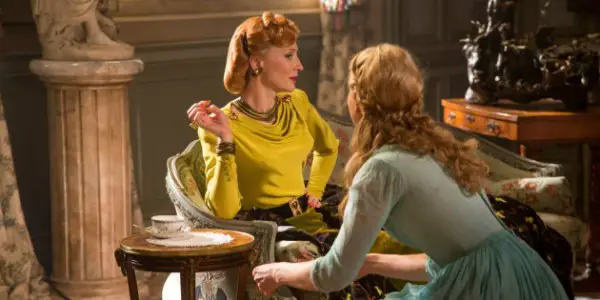
Likewise the actor can position themselves (with the director’s instruction) to illicit a number of thoughts and reactions from the audience. In Jaws, Brody draws away from Hooper and Quint as they begin to compete, emphasising his rather docile nature. In Glengarry Glen Ross, Jack Lemmon stoops to make himself seem small, so as to emphasise Levene’s lack of confidence and defeat.
A great and recent example sees Cate Blanchett as the step-mother in Cinderella. In this she holds her slender frame so that she appears always to be posing, and also apart from or disgusted with Cinderella, emphasising her dislike for her.
Movement Through Space
While it easy to talk about mise-en-scène as a static image, there is, of course, much more to it. As scenes move on and camera angles change, so the movement and sound adds to the meaning. The opening of La Règle du Jeu involves a long tracking shot as heroic pilot André is greeted by the press. The confusing mess of bodies and cameras and lights between us the audience and André emphasise the chaos of his new life following his great achievement. However, as he moves away from them so is his humble detachment from his achievement is driven home.
In Casablanca, as Rick approaches Isla’s table the scene cuts between a wide shot of the café and a close-up of Isla’s face. Her emotion becoming more visible as Rick approaches deepens our attachment to her and her shock at seeing him again, adding great gravitas to an otherwise simple scene. The Revenant is another great, more recent, example of how the structure of the mise-en-scène plays a great part in the movement of a scene.
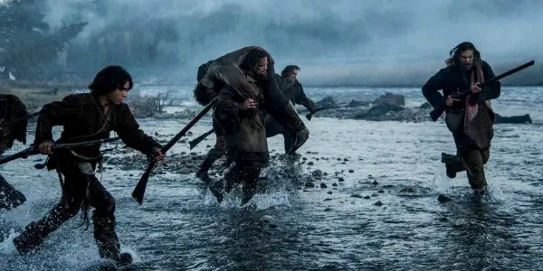
In the opening scene, as Glass and the men are forced to run, Iñárritu emphasises the chaotic and frenzied nature of the attack by swinging the camera between the attackers and the attacked. He also creates great layers of texture by placing actors in the back and foregrounds, further emphasising the mass movement of the characters. If you want to know why you don’t see this in every film it’s because it is very difficult and very complicated, and not easy for many directors.
Editing
As with cinematography there are two types of editing, American and European. And like the cinematographical techniques so these two have blurred together over the years, perhaps even more so. However, editing still has more personality than many of the other techniques stated above. This is because a cut is a very exact and obvious choice, and when made at the right moment can have a huge affect on how we see a scene. As with their cinematography counterparts, American editing is biased towards keeping the audience in time with the action, European, however, likes to play with audience expectations.
Some of the great editing we see today has been founded on the principles of Soviet Montage cinema. Where directors such as Sergei Eisenstein and most notably Dziga Vertov would exercise what they called the ‘kino-eye’. This would involve editing together shots and/or scenes to create linkages between characters or people, through time and space. The juxtaposition of images would insist on comparisons to be made by the audience and relationships drawn between images. One of the most famous sequences can be seen in Eisenstein’s Battleship Potemkin where the stone lion appears to stand and roar, and so becomes emblematic of the rebellion of the Russian people.
This foundation of juxtaposition has gone on to breed a type of editing that can be used to create atmosphere in a scene or sequence by accentuating its double meaning. A couple of excellent examples can be seen in Nicholas Roeg’s Don’t Look Now. In the opening sequence the image of Christine playing outside is spliced with images of her parents. Her movements draw comparison with her mother’s, her reflections on the water correlate with the glass negatives on her father’s light box, then blood spills across the glass negative to mimic the colour of Christine’s red coat, but also portend of her death.
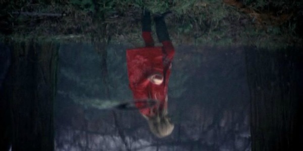
Roeg uses similar cross-cutting in the sex scene between Laura and John, where their poring around a newspaper is juxtaposed with the sex act itself. Not only does this draw attention to the familiar and perhaps unromantic beginnings of married sex, but also plays with the expectation of the audience. Building on our anticipation, even though it is unnecessary. Steven Soderbergh paid a delightful homage to this scene in his film Out Of Sight.
As previously stated, because good or unusual editing often stands out, intriguing examples are usually easy to find. The juxtaposition of Janet Leigh’s eye with the blood going down the drain in Psycho, emphasising the emptiness of her eyes, and her death. Steven Spielberg also created a great number of examples in Schindler’s List, juxtaposing the every day lives and debauchery of the Nazis alongside the treatment of the Jews.
In fact, the juxtaposition of sex and violence with ‘normal’ images is all too often done. Often done to unsettle the audience and draw them into the character’s thought process. However, not all sequences are so dramatic. In Testament Of Youth, Vera’s monologue, as she writes to her brother, is cut with images of him at a rugby game. He looks up into the camera as though he is seeing her, and she him, strengthening the connection they have with one another.
This is not to say that all good editing must be challenging to the audience. Truly great editing sometimes rests in something as simple as knowing when to cut a scene and knowing when to let it run on. Darren Aronofsky is a great proponent of quick cuts, getting to the point of the drama, a technique which Edgar Wright has brought into comedy, to equally get to the point of a joke. Conversely we have the directors Andrea Arnold and Lynne Ramsay, who allow the camera to linger. An intriguing technique which unnerves the audience, as the scene goes on beyond the boundaries of their expectations.
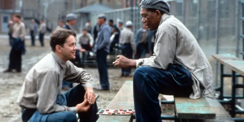
A Final Example: The Shawshank Redemption
Mise-en-scène is perhaps such a difficult thing to explain because like poetry analysis it involves you extrapolating meaning from people and objects, but ones that are constantly moving. It makes sense to divide up all the elements of mise-en-scène, but it can also overly complicate and cause confusion. In an effort to make this all a bit simpler I leave you with one final example, a scene (sequence) that most people have seen. From the film The Shawshank Redemption this is Andy Dufresne’s triumphant escape from Shawshank prison.
This sequence takes place immediately after Andy is discovered to be missing and so the audience can bask in the idea that Andy’s safety is secured. This description of his escape, however, is important to events as it is Andy’s denouement, his revenge on the Warden, his last laugh. Note the camera pan down at the beginning of the sequence, drawing attention to Andy’s shoes. The shoes themselves and their shine are demonstrative of Andy’s rebellion against the Warden. He has taken the Warden’s trust in his servitude and used it for his own means, a true act of revenge as he is making the Warden complicit in his escape.
Andy then sits, in the half-darkness, his tense grip on the rope belying his calm exterior. The director Frank Darabont has played on our expectations, in this earlier scene we panicked for Andy, now his tense state has been imbued with new meaning. He looks toward the poster on the wall. But where once we thought he was pleading with Raquel Welch now we see that she holds his salvation. The music rises as Andy ponders what to do next. He stands and closes his eyes gently as he begins to carefully remove his clothes. His resolve is calm and understated.
The camera pans down to reveal the suit he is wearing (another joke at the Warden’s expense), cuts, and pulls in to show Andy storing his possessions in a plastic bag. The most important of these, and Darabont makes sure to emphasise this, is the set of chess pieces. They are symbolic of Andy’s diligence and patience, they are representative of the time he has spent in the prison. Darabont shows us another side of Andy here, an emotional side. A sentimental attachment to objects he so lovingly created and cared for, even thought their heft shall surely weigh him down. Like Raquel, and the posters before, they were his salvation. They were what inevitably led him to digging his tunnel. They are also simply representative of the game of chess and the chess player’s mind, one that is even and focussed, one that plays the long game.
Andy makes his way down the tunnel and into a vertical passage. The camera tracks him in a wide shot to emphasise the largess of his body in the narrow space. The small amount of light drifting in picks up on details, but more importantly the dramatic light of the storm outside draws our attention to the immensity and risk of Andy’s escape, and also the fear that must be cursing through his mind. The music rises gently and calmly as Andy sits atop the pipe. His hair now wild and his eyes wide in anticipation, conveying the energy running through his body. Reminiscent of Doctor Frankenstein, he beats at the pipe along with the storm, calmly but with a ferocious purpose. The storm is part of Andy’s plan, but it is also a pathetic fallacy, in the storm we see Andy’s fury and veracity, his mind externalised in the storm.
Andy leans into a close-up of his face, emphasising his still boyish looks against the stark darkness of the sewage tunnel. As before he inspects it with his torch, emphasising Andy’s methodical nature, even at this urgent point. As Andy struggles through the tunnel his torch moves in the darkness, gesturing to the small cramped space he is in. The sewage pipe is represent not only of Andy’s determination to escape but is symbolic of all the shit he’s taken up until this point in his life. Red’s voice-over is important here, as it lulls the audience at a point of extreme discomfort. The camera then pulls out from the prison, emphasising what Red is telling us, and driving home exactly how far Andy has travelled.
Andy throws himself into the water, calmly floating his freed body. He gets up and runs away from us, he runs and runs until he is free of the water, free from the sight of the prison. The camera shot widens and the music becomes louder as Andy pulls at his clothes, freeing his naked body. He finally stops, looking up to the sky, smiling. He then rises his arms up to the sky as the music rises and the camera pulls back. Andy laughs. The religious references here are rich. Andy has been reborn, he has been baptised and made anew. He stands with his arms outreached, reminiscent of the crucified Christ, but also in an innocent childlike stance of joy. Ironically, though, he did not succeed by adhering to the Warden’s narrow minded idea of religion but by using logic and a patient perseverance.
Conclusion
Mise-en-scène is the most basic film term, and also the most complicated. But learning about it at a basic level is only about one thing. Asking questions. Why is that there? Why did that happen? No shot, no image, no scene is ever ‘just because’. It’s much more than that, and the greatest filmmakers will imbue their work with reasons and meanings that result in films such as Citizen Kane being explored even years after their original release.
For those of you more film theoretically inclined you’ll find that my breakdown here bares some resemblance to the work of David Bordwell and Kristin Thompson. That’s because every time I studied mise-en-scène, the course I was on would base their teachings on Bordwell and Thompson. They are ubiquitous with film theory and I would highly recommend their book; Film Art. It is a great foundation text that will teach you pretty much anything you would want to know about film.
What are some of your favourite films that have great mise-en-scène?
If you have any questions, please don’t hesitate to ask below.
Does content like this matter to you?
Become a Member and support film journalism. Unlock access to all of Film Inquiry`s great articles. Join a community of like-minded readers who are passionate about cinema - get access to our private members Network, give back to independent filmmakers, and more.
I love film, more than people probably, and I will watch pretty much anything. Seriously, anything! I have a postgraduate education in film & have spent an exceptionally long time trying to get inside the film industry. I'm a big believer in treating every film the same, and bringing something new to the film theory table, giving reasons for every argument made. You'll find that I'm an empathetic and fun sort of reviewer, at least, I like to think so. If I'm not watching films I'm doing exceptionally nerdy stuff, like watching documentaries about the history of medicine and collecting photos of old post boxes.
